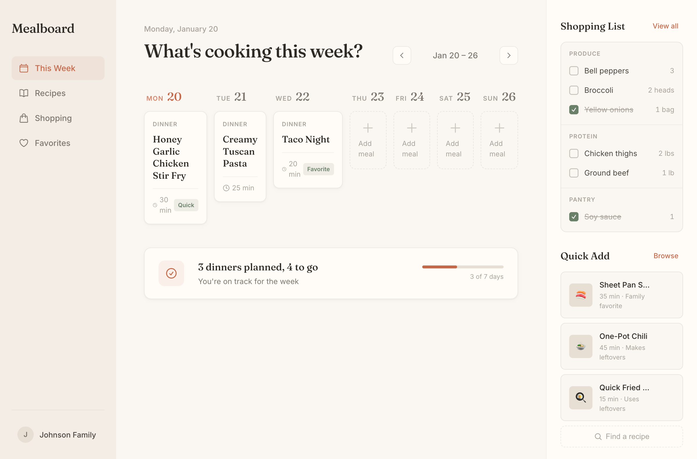
Meal Planner
Family meal planning with weekly board, grocery list, and quick-add recipes. Built for busy households.
Prompt used
A web app tool for planning meals. For busy households juggling schedules. Core tasks: plan the week, build grocery lists, discover recipes. Should feel warm and inviting, like a kitchen notebook.

Design notes
Warm cream and terracotta palette — kitchen-native, not tech-borrowed
Fraunces display font for warmth, Inter for UI utility
Token names evoke the product world: ink, parchment, sage
Week board with day labels that feel handwritten (Fraunces numbers)
Conversational progress: "3 dinners planned, 4 to go" not "3/7"
Grocery pad with categories feels like a torn notepad
Empty states invite filling with dashed borders and "Add meal" prompts
Family context in sidebar ("Johnson Family") reinforces personal feel